When it comes to Interior Design Color Psychology, Color Palettes can either make or break a space. Color can certainly enhance the visual world, including our home’s interior.
So what exactly IS Interior Design Color Psychology? It is the school of thought that focuses on color as a means of creating a specific atmosphere and mood. It shapes our understanding of the environment as it adds definition and distinction to all things. According to the theory of colors, different hues can truly promote various feelings and emotions. Read on as we explore Color Psychology in Interior Design: How Color Affects Mood.
Different shades can affect both your mood and your appearance
The psychological effects of color may surprise you. Whether you go all-out with a color scheme or add a pop, like a bold color wall, you’re certainly sure to feel its impact. Furthermore, color theory and the psychology behind it shine a light on how the visual world influences people individually.
As a result, you can breathe new life into a dreary old room or transform your entire interior with color. First, pick the effect, feeling, or mood you want to evoke in each room. Then, move on to identifying the corresponding color palette using our quick guide on color psychology below.
Interior Design Color Psychology 101


Color psychology in interior design is about the close connection between colors and emotion. That is, it relates to how tones affect the human brain. It’s one of the most powerful interior design tools – having more of an impact on a room’s mood than any other factor. For instance, something as small as changing the kitchen cabinet color can make a substantial difference.
However, two people could react differently to the same shade. Studies have proven that the psychological effects of color on human behavior vary from person to person. So, carefully consider the atmosphere you want for every room in your home. Thereafter, chat with your live-in family to see if they’re on board. This way everyone is bound to love the spaces they inhabit.
Colors and Feelings: Setting the Mood of Your Room
By and large, warm tones like red, orange, and maroon make people feel passionate or energized. Cool tones like green, blue and purple, on the other hand, have a relaxing effect. And finally, neutral tones like gray and white usually leave people feeling serene.
The psychological effects of color are certainly plentiful and exciting. In fact, the right shade can certainly spruce up an interior – especially when matched with the right room!


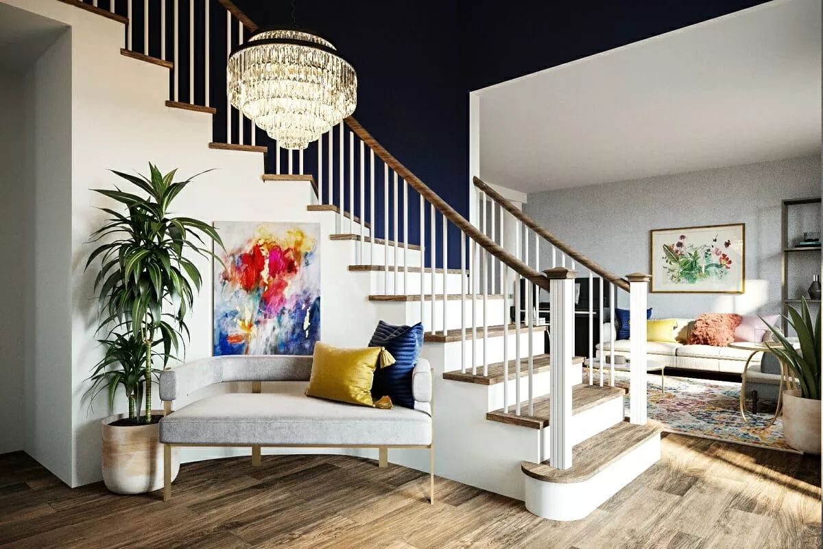
Interior Design Color Psychology: White and Gray
White and Grey are often under-appreciated colors but have immense power in interior design. They have a feel of light and bright, acting as a universal neutralizer. They are both versatile colors that can be used to great effect in nearly every space in your home. If you want to make a small room seem far larger than it is, white and gray is certainly the way to go.
Other design elements that pair especially well with white tones include glass and wooden accents, as well as pops of black to create balance. You could consider adding a vase with a gorgeous display of flowers to add a pop of color to this otherwise neutral room.
Color Psychology in Interior Design Using White and Grey – White is usually associated with peace and harmony. It symbolizes purity, clarity, light, and divinity. Using lots of white in your design can have a calming effect on your psyche. It makes the space look bigger, brighter, better ventilated, and cleaner. This is why white is often used in abundance while designing a small or ‘not so effectively’ constructed commercial space. It’s an ideal color for people who tend to feel claustrophobic, tense, anxious, or agitated. It calms them down and brings a certain level of balance and harmony into their lives.


Color Psychology of Interior Design: Red
The color red is the most vibrant color that represents emotions in their entirety. Whether it is dark shades like maroon or light shades of ham red, they create an atmosphere of love and camaraderie. Implementing the color red in your design plans adds excitement and vigor to the entire room
You can use red in office buildings or home offices, in the living room, and in the bedroom. In offices, red inspires leadership, willpower, high energy levels, and friendship. When used in the living room, the color red in all its shades inspires friendship and stimulates conversation. But the best utility for the color red is in the bedroom, where it kindles feelings of love, desire, and passion.
Red also inspires feelings of anger and revenge, which is why it is best to combine it with calming color tones such as white or beige to balance human emotion. You can add higher nuances of red to stimulate productivity but make sure to compliment it equally.
For instance, you can use red on one or opposite walls in the bedroom, while using calm and subdued tones in the overall room. This will instigate passion while keeping the blood pressure levels in check with the help of complementary colors such as yellow, natural tones of light green, or plain white touches.


Color Psychology of Interior Design: Brown
A lighter and softer deviation from red is the color brown. With its natural hue and soft, reassuring essence, brown can work wonders in vast spaces to synchronize different elements of modernism and classic.
The color brown is best used sparingly. As interior designers, you must ensure that the wall colors, room colors, and the color of the overall interiors make the inhabitants feel warm and comfortable. The color palette you choose must also serve to inspire them. Brown tends to relax the senses, maybe a little too much, leading to inactivity and lack of goals. On the other in combination with vibrant shade and other natural hues, brown can symbolize resilience and security.
In interior design, brown is used abundantly when it is meant to create a rustic look and somber atmosphere. Although elegant, the color has a tendency to evoke depression, so ensure that you combine it with happy colors such as yellow, white, red, green, and orange.


Color Psychology of Interior Design: Yellow
The color yellow is synonymous with sunshine, thereby spreading the effect of light and happiness. Yellow is also associated with intellect and prosperity, due to its close associations with the color gold.
In interior design, the color yellow is recommended for the kitchen, dining areas, hallways, and bathrooms. The color automatically uplifts people’s spirits making the room feel bright and sunny.
Although most shades of yellow have a positive effect on the psyche, dull yellow colors instigate a feeling of doom, decay, and sickness. It is best to use yellow in its bright shades around the house. Make sure to use it sparingly though, as yellow tends to stimulate uncontrollable emotions. Due to the extremely optimistic effect, a completely yellow room can drive up blood pressure. The brain associates high blood pressure with feelings of anger thus causing people to lose their temper without any provocation.
Yellow also adds a level of sophistication to interior design, especially when it is paired with grey or white. Yellow stucco walls with grey linings and patterns gained popularity in the 90s and it is making a comeback with better quality materials.


Color Psychology of Interior Design: Green
When people see the color green, they think of nature. Although, in reality, nature can be cruel, the human psyche associates nature with freshness, peace, and trust. Thus, green is a powerful color in interior design. Additionally, pale green is promptly associated with the color of pea soup, which is comfort food. It helps relax the senses and lower the levels of hypertension and blood pressure.
Green is an extremely versatile color. Different shades of green promote different emotions. While light and aqua green have a calming effect, dark green is mostly associated with greed and jealousy. Olive green on the other hand is recognized worldwide for peace and harmony.
Green can be used in different shades throughout the house. You can use lighter shades on the walls and create contrast with dark shades of green with plants. The effect of the dark shade is neutralized as plants automatically remind people of nature. The color green mostly has a calming effect with a sense of security, which makes it an ideal color for interior design.


Color Psychology of Interior Design: Blue
Blue is among the most calming colors in the palette for interior design. In regards to the psychological effects of color, blue relaxes the mind and slows down heart rate, metabolism, blood pressure, and hypertension.
Aquatic shades of blue, in particular, such as sky blue and light blue have a healing effect on the mind. It reminds the inhabitants of the sea or swimming pools. Blue is the only color that has an array of positive effects, and little to no negative effects on the psyche.
You can use different shades of blue in all areas of the house. You can use darker shades such as royal blue as primary colors and pair it with yellow and use it for the kitchen, playroom, etc. You can also use a combination of light and dark blue colors in the bedroom and dining room.
Although using blue in dark rooms with small spaces can create an eerie feeling like that of being trapped in ice, you can add a touch of warm colors to neutralize the effect.
Most dark shades of blue are associated with elegance, luxury, and royalty, while Sapphire colors add prominence to the design plan. Blue lights are also easy on the eyes, thereby decreasing any discomfort. All in all, blue is an excellent color scheme that works well with all modern and contemporary interior design trends.


Color Psychology of Interior Design: Purple
The color purple is usually associated with elegance and royalty. Purple color schemes work well in areas that inspire creativity and design. Bright hues of purple such as violet or plum add flair to your design scheme. Whereas, lighter shades of purple such as lavender and mauve create a calm but regal effect in your design.
Since purple inspires creativity, you can add it to dressing rooms, walk-in closets, in-house art studios, or even the kitchen. This color is particularly popular with adolescent teens as it inspires them towards creative and performing arts and helps them find their path.
The regality of purple also works well in the foyer or living room where your guests spend time. It gives an essence of calm, elegance, and luxury.


Color Psychology of Interior Design: Pink
Blue is among the most calming colors in the palette for interior design. In regards to the psychological effects of color, blue relaxes the mind and slows down heart rate, metabolism, blood pressure, and hypertension.
Aquatic shades of blue, in particular, such as sky blue and light blue have a healing effect on the mind. It reminds the inhabitants of the sea or swimming pools. Blue is the only color that has an array of positive effects, and little to no negative effects on the psyche.
You can use different shades of blue in all areas of the house, as well as darker shades such as royal blue as primary colors. Blue is easily paired with yellow for use in the kitchen, playroom, etc. A combination of light and dark blue colors in the bedroom and dining room also works well.
Although using blue in dark rooms with small spaces can create an eerie feeling like that of being trapped in ice, you can add a touch of warm colors to neutralize the effect.
Most dark shades of blue are associated with elegance, luxury, and royalty, while Sapphire colors add prominence to the design plan. Blue lights are also easy on the eyes, thereby decreasing any discomfort. All in all, blue is an excellent color scheme that works well with all modern and contemporary interior design trends.
Need some help with your interior design color palette?
Sometimes choosing the right hues and color palettes for your home can be tricky. We’re here to help you so reach out to us for a free consultation. Email Collab@joyskinner.com
I hope you enjoyed this posting, Color Psychology in Interior Design: How Color Affects Mood. We’d love to hear your comments so if you have suggestions, like the post, or just want to say hi, the comment box is on the right-hand side. Also, I’ve placed a few Pinterest Pins below. If you like this post, please share it with your Pinterest Friends.
Until next time …. Joy


Reference and Photo Credits:
- Dracula
- Farrow and Ball
- Benjamin Moore
- Foyr


